


The clay is Standard 266, a beautiful deep dark chocolate brown after the glaze firing. The glaze is Western Opal Fire Art. Inspiration provided by Didem Mert.
The clay is Standard 266, a beautiful deep dark chocolate brown after the glaze firing. The glaze is Western Opal Fire Art. Inspiration provided by Didem Mert.

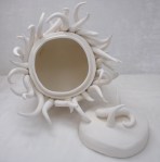

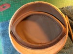
Handbuilt lidded box. Low fire white clay. Here it is at the bisque stage. (And a reminder of what it looked like at the leather hard stage.) It fires up to a very nice, bright white.
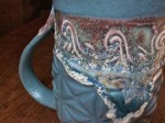
I’m considering a very light green/celadonish glaze, with clear glaze over splashes of red underglaze at the very tips of the writhy-bits.

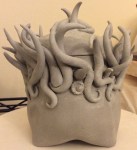
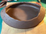
I used to do a lot of wheel work, but in the past year hand building has really grown on me. I just recently made a couple playful closed box forms in low fire, white clay. Here there are in the leather hard stage. Basically dried mud. Very Very Very fragile. For the bottom one, if it makes it to the glaze stage, I’m thinking a very light celadon looking greenish blue, fading to clear white near the top of the writhing squiggles, and a smidge of red at their very tips.
I might have a bit of a thing for beauty and the macabre.
Inspired by Liz Zlot Summerfield handbuilt forms.


This one is my favorite.
I pretty much knew I wanted this screen cap and that the theme color would be red. I mean, how could it not be? The RED mark and all.
I started off with the screen cap:

Played around with photoshop until I had the base I wanted:

And then red… red… how to use red:

Interesting, but where exactly am I focusing the threadwork. Alright, trying the opposite:

Innnnteresting. Not quite right though. Let’s try making the colors a little cooler.

HOLY MOTHER OF GOD!
Wow, yeah, that was it.
Look. I mean seriously, look at this part:

Look at all that depth of color! And incredibly intimidating. Unlike the Contemplation photo where the ideas preceded the image, the image preceded the ideas. How the heck was I going to do this?
I did some trials. I wanted to get that sense of depth, so I laid down a layer of small, random-y cross stitches.

and then a layer of thinly placed straight stitches over it.

Okay, okay. So far so good, maybe I can do this. Here we go.

Working on the plaid while I could think some more about what colors I wanted in the lighter spaces.

Tackle the face. Teeny tiny stitches.

I used the blue thread as a guide to guide the straight stitches.

Okay, take a deep breath. Time do do the over layer. BTW: it cracks me up that the primary red I used was this color:


This is an earlier version. You can get now why I ripped it out and worked on the face instead of proceeding. Needed some time to think about it. The straight stitches were just covering up all that glorious cross-stitched color.
Plus, something was bothering me. The literal translation of the color was working well. But something was lacking. The color was gorgeous but the picture wasn’t SAYING anything. So I bugged meesasometimes and basically just vomited my concerns all over her. You know how a beta can sometimes just say something and it sparks an explosion of thought? That happened. She said that she could see how the plaid would need straight stitches, but the rest of it wouldn’t. AHA! I had been so focused on the image and not the idea that I’d pinned myself into a corner.
I knew I wanted to give the impression of being stretched and pulled to the point of snapping. You ever see ferrofluid and it’s effect under a magnetic pull?

THAT’s what I wanted. That lead to a trial in photoshop.

I took the plunge. Here we go:

I liked what was happening, but it needed a greater degree of contrast of color to give sense of depth and more randomness. After much dint of adding lighter colors underneath and adding and clipping out too many dark ones on top, this is the final version.

That… went surprisingly well. Dang.
It was the last piece I tackled. I saved it for last because of how intimidating it felt. I figured I’d need the skill development before I got to this one.
Here it is getting ready for photographing.

I got some really good advice from bflyw about camera settings and setup for photographing something that’s so dark. Apparently your automatic settings assume that nothing could possibly be that dark, so it ends up overexposing the image. I played with the manual settings to underexpose the image as she suggested and got more strategic about reflecting light onto the surface of the work.

It made the difference between this:

and this:

High resolution versions of The Red Mark and the other artwork can be found on imgur.
The diary for Contemplation can be found here.
Here’s the diary for Sam’s Blue Period.
Chickcheney wrote a lovely series of vignettes that do a wonderful job of capturing the emotions I was trying to portray. Where I built on a base of images directly taken from the show and added thread to evoke a mix of tension, horror, helplessness, sadness, and longing, she did something very parallel to that with words. She took the events toward the end of season 9 and added to the narrative so that it emphasized that complex interplay of emotions. The story she tells is very evocative. Go read it.


Oh, man, this one gave me fits. I’m still not fully satisfied with it.
I have a tendency to fall into a “Grand Plans” mindset where I’ve got all kinds of ideas that sound good on an intellectual level, but in reality just end up muddying things.
I knew I wanted to evoke energy, a sense of clashing and binding that contrasts sharply with the separate and contemplative nature of the original screen cap.

I did the usual bumbling about in photoshop. Initially, I was considering a green theme, given that I had blue, gold, and red themes already.

But, nothing “popped.”
I thought maybe black/white and then introducing color to specific parts to highlight them. I thought it might evoke being drained of color and vitality and the only energy and life being the connection between.

I dunno. Green against the black and white didn’t accomplish that, however.
At the same time I was casting about for inspiration for what exactly I’d be adding to the pic. I looked at nebulae, fire, and angel wings and finally ran into this pic:

Isn’t that great? As far as I can tell, it’s called “Source of human power – Angel" by allanwalkey.
So much energy in the line work. A couple things struck me about the use of color, too. One was the use of gradation of warm colors. I’ve been wanting to do something with halation for a while. See how the gradients of color set next to each other make them seem to glow?
There’s a reason why and it all has to do with how our brains process color and contrasts. See where the colors butt up against each other? Look for a faint brightness along the edge in the lighter color and a faint darkness along the edge in the darker color. That doesn’t really exist. In reality, each bar is a solid color. Our brain pumps up the volume on contrasts because edges are so important in being able to see how this thing we’re looking at is a whole object, set aside and different from the stuff around it.

So, I hoped that using a gradient of color like this would give it some energy.
And then I ran into this quote from wikipedia: Complementary colors are pairs of colors which, when combined, cancel each other out. … When placed next to each other, they create the strongest contrast for those particular two colors.
Which I thought was all kinds of appropriate for Sam and Dean’s relationship. When combined, cancel each other out, but when placed next to each other create strongest contrasts. That really fit with the theme of Ties that Bind. Bound together, with both the negative and positive connotations of that connection.
I ran some tests.


I struggled to get a focal point. I was noodling around on the internet, looking up meiosis and mitosis on the inspirational thought of growth and separation. I ran into Fluorescence Microscopy. OOOF!

I liked the sense of this cocoon around the action.
Here’s my first attempt at it.


meh. I didn’t much like the rays, either. There’s just too much going on. I was hoping to evoke the complexity of clashing and binding by where the rays come together in the middle, but it’s just a mess. No focal point. Bleh! Grand-Plan-itis.
I ended up cutting away the brown and replacing it with couching – so texture but not enough to draw the eye away from the middle.


Took out the lighter rays close to the guys. I loved them, but it drew the eye away from the middle. Replaced the middle with a more even "explosive” set of rays in the lighter range of colors.
So, this is the end product. It’s an improvement, buuuuut. Still lacking something. I may cut away the brown couching and replace it with a web of straight dark threads, browns at the bottom grading up to black on top to give it depth. Maybe it’ll highlight the sense cocooning and claustrophobia. We’ll see.

Btw: This is what happens every time I try to take pics. Lil Ms. Diva Kitty herself.

High resolution versions of The Red Mark and the other artwork can be found on imgur.
I’ve been enjoying reading fic written for this year’s SPNJ2BB when it caught my attention that this submission (A Little Bear and His Wolf) was accompanied by embroidered artwork by Meesasometimes. What followed was a brain implosion that derailed all other projects.


I thought that these were all the colors I’d needs. Ha!
This is what I ended up with:

So, you may remember Sam’s Blue Period.

What I discovered with this piece is that jagged, overlapping, loose herringbone stitches worked best. I could lay down stitches one color section at a time and go back and fill in overlapping stitches to soften the transitions between sections. There’s not a whole lot of color range so that seemed to create the best transition between colors and convey that sense of three dimensionality.
I’m finding that each piece has it’s own subtleties of what stitches and approach to layering work best.
Brothers Embrace
Here’s the screen cap I was working off of.

Manipulated in photoshop like Sam’s Blue Period to emphasize specific areas. For this one I wanted bright, warm, sun-like gold colors.

Which I promptly covered up with flat, boring, loose herringbone-ish stitches.

Yuck.
I also discovered that this was such a large “canvas” that just suggesting form made the stitched area just look like a big ole blob. Layering color on top of the base stitching it to capture the sense of dimension and scattered colors was problematic. It worked, eventually, but only after breaking and bending needles and drawing blood. :))
So, an approach that’s organized around laying down color first and not organized around creating form from the beginning didn’t work. I hope this makes sense.
So, instead, smaller x-stitches and working within a smaller subset of areas when laying down the first layer seemed to be much more effective.


This was what I ended up with and it just wasn’t quite right.

Nothing like another eye on a project. I got a beta from Meesasometimes and she noted that some strategic use of contrast would help punch up the image.
Here’s a pic of my setup for working. If you’re not watching Mark Watches Supernatural, you should be. 🙂

High resolution versions of The Red Mark and the other artwork can be found on imgur.
The diary for Contemplation can be found here.
Here’s the diary for The Red Mark


I’ve been enjoying reading fic written for this year’s SPNJ2BB when it caught my attention that this submission (A Little Bear and His Wolf) was accompanied by embroidered artwork by Meesasometimes. What followed was a brain implosion that derailed all other projects.
First step, photo manipulation:
Here’s the base photo:

With a darkened background and addition of lighting and contrast. I can’t tell you how long that took. Let’s just say that Photoshop and I are not friends and leave it at that.

And then many and various attempts to manipulate color:
Nope.

Nope.

Eegads. Just, no.

Before settling on:

Finally!
On to putting it in fiber.
I ran into Lauren DiCioccio’s work while looking for inspiration.
All kinds of fun things happening with color and texture. You can find more of her work here.
I thought I might give her approach of doing a segment at a time a try.
Rejected embroidery attempt #1:

Yuck. This attempt was printed on card stock fused to black silk. I’ve rejected it for a variety of reasons, one of which is because it’s just flat and uninteresting without the variety of color DiCioccio uses, but also, so not worth the effort of trying to push a needle through cardboard.
So, I scrapped that. Found this product: Silk inkjet printable fabric sheets
Rejected embroidery attempt #2:
Completely forgot just how sheer silk is and promptly attempted fusing it to an underlying fabric to give it strength. Ha! No pictures of that failure. There’s definitely a loss of definition when printing on fabric to begin with. This just looked like I dropped it in a mud puddle.
So, on to my next attempt, which involved lots of very fine pins and a steady hand sewing the sheer printed charmeuse onto a more solid raw silk weave background.
Looked around for other inspiration for embroidered portraits and rediscovered Cayce Zavaglia’s work:

Isn’t that gorgeous? You can find more of her work here.
That led me to embroidery attempt #3, currently in process here:

Sam’ Blue Period
Zavaglia has a painterly approach to her work which I can in no way match. I know absolutely nothing about using layers of color in that way. My medium usually involves taking two dimensions and manipulating them into a third, like ceramics, silver-smithing/jewelry making, and many and various forms of fiber. I suck at drawing and painting. My attempts are far too literal and bound to the concrete when I attempt to work in one set of dimensions to pull it off.
That said, I’m learning a ton about the kinds of stitches that work best to get the texture I want (a very loose and random herringbone, btw). The glow of silk contrasted with how the stitching catches both light and shadow is growing on me. The material is a joy to work with. I am also growing more confident in my ability to layer colors atop each other rather than relying on a paint by numbers kind of an approach.
My next challenge is to fill in a whole section with one base color and add other colors atop it to highlight and shade. I think I’ll do that with Sam’s forehead. It’s a smooth and broad enough plane to be rather forgiving, I think. 🙂
After I finish Sam, then I’m moving on to Dean.
High resolution versions of The Red Mark and the other artwork can be found on imgur.
The diary for Contemplation can be found here.
Here’s the diary for The Red Mark


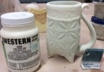

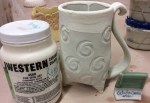
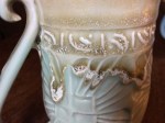
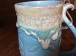
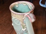

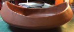
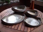
Finally pulling things out of the kiln that I actually like. Woohoo!
clay body: Tom Coleman porcelain
construction: slab built, impress the clay with the textures first before picking the slab up to make the cone. Check out Sandi Pierantozzi’s free video on slab building of tripod pots for the technique.
glazes: Fire Opal Art (cone 6 glaze) accents over Elaine’s Best celadons
glaze application: Sprayed on. Pretty thin coat. Got a bit of “orange peel” and lack of translucency. The insides are more translucent, so I think they may have been in a “cold” spot in the kiln. Still like ‘em, though. 🙂
glaze firing: cone 9 reduction/gas


